rebranding: welcome to the new happy tails!
It’s finally here! Welcome to the new online digs of Happy Tails Pet Photography!
This has been a long, and somewhat painful process for me, because a) I have a hard time making decisions, and b) I am not a “techy” person, so the idea of designing a new online home was insanely daunting!
Rebranding Happy Tails was a difficult task to wrap my brain around, too. I really liked my old logo and colours — they were happy, fun, colourful and all the things I wanted people to associate with my brand. But, in the year I’ve been running my pet photography business, I was already experiencing growing pains with my branding. My logo was a funny shape, which made it hard to use in certain applications, and it didn’t have an element I could pull out and use on its own as a mark — I was always forced to use my entire logo. And although I liked the bright pink and green colours, I started to feel like they were competing with my imagery rather than enhancing it. Add to these factors that my old website was built using Flash, and therefore not visible on mobile devices, and I thought it was time to bite the bullet and change things up.
My first step was finding an amazing graphic designer to help me pull everything together. Luckily, I live with one! Brian Roberts, of Brian Roberts Photography + Design is a brilliant designer (and I’m not just saying that because he is the father of my child) — he was so patient, listened to all my zany ideas and still managed to come up with a logo that feels just right.
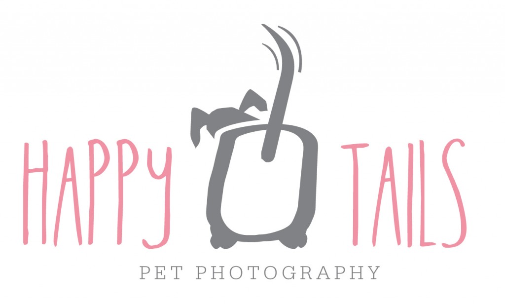
My instructions to him were twofold: I wanted my logo to look like a dog drew it but wasn’t too comic-y (no joke, that’s what he had to work with!) and I wanted it to incorporate an element that I could pull out and use on its own as a watermark, stamp, etc. We went through several (SEVERAL) versions. Just before I was about to be dubbed the most difficult client ever, he showed me this one with the dog bum and wagging tail right smack in the middle. My first thought was, “Do I really want a bum in my logo?” My next thought was, “Heck yes!” I kind of love my new dog bum. It is hand-drawn by Brian so it is totally unique, just for me. I love that it’s not perfect and it has personality (kind of like Chloe!). Plus, the wagging tail was a must-have, obviously! The font is also hand-drawn and just has a friendly, approachable, cosy feel to it — to my eyes it really looks like a dog drew it! To balance the casual, imperfect look of the “Happy Tails” font, I’m using a more formal serif font below for “Pet Photography.” Overall, I think my new logo stays true to all the things Happy Tails is about: playful, fun, friendly, happy pet photography.

Next, I toned down my colours. I stayed with the same palate of pink, green and brown and gray, but just made everything more subtle. Is it girly? Yes, it’s a little feminine, but not so much that it will scare the male dogs away. Most importantly, the colours let my photography be the star, which is the most important thing.
My new home is a blogsite: it’s a website, with portfolio, session information and all the other important information clients need, and a blog, which allows visitors to stay up to date on all the latest news, sessions, giveaways and all that good stuff. With Facebook changing every day, I’m hoping my new blogsite will be become the “go to” place for Happy Tails info. Please add it as a bookmark and subscribe to receive posts by email!
I pretty much created the entire blogsite on my own. I started with a basic template, but then spent months customizing and tweaking it to get the contemporary, clean look I wanted with easy navigation and loads of photos and information. I now know more about CSS, SEO, FTP and a whole bunch of other acronyms than ever before — I swear, my brain feels kind of bigger.
Please sit and stay awhile, and check out the new site. I would love to hear your feedback and please let me know if you come across any broken links or other glitches — I’m sure there are a few, since migrating my old blog to the new platform did encounter a few bumps along the way (for example, my older posts display two “Like” bottoms at the bottom — one imported with the post, another added automatically by the new platform. It drives me nuts!). I will continue to tweak things and finish up some of the behind the scenes touches in the coming weeks.
Woof and hello to the new Happy Tails Pet Photography!
Wags,
Stacey
