hardcover photo book | ontario horse photography
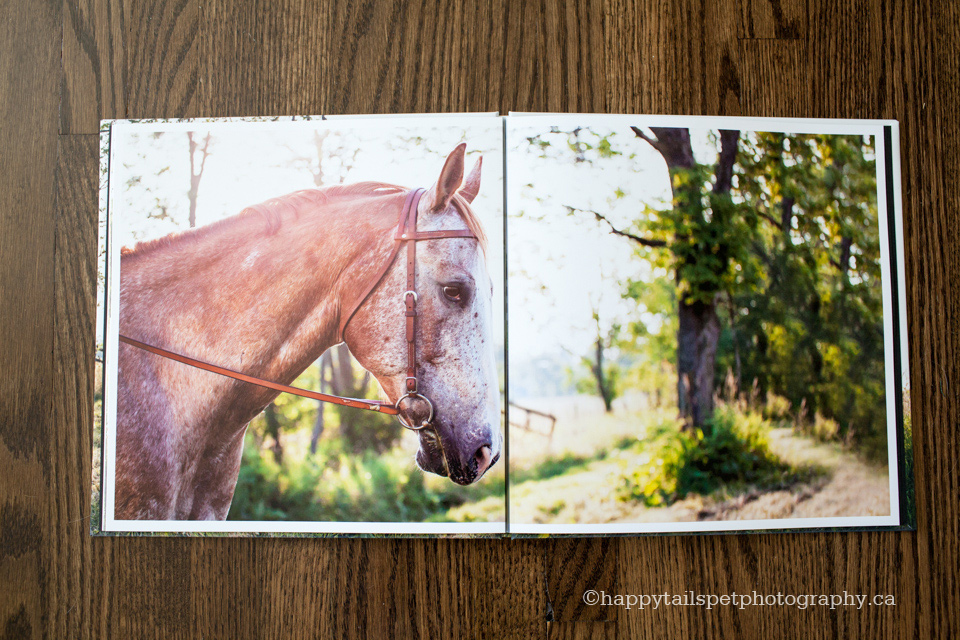
One of my favourite parts of a client photo book is the design process. Don’t get me wrong, it is a ton of work, but I love the creativity involved. I am a font nerd, and spend way more time than necessary choosing the perfect serif or sans serif for the cover that reflects the personality of the pet and the session as a whole. I love piecing together each page — what image would fit nicely here, or how can I make that page pop over there.
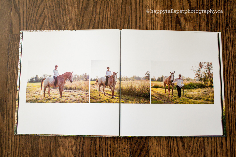
I have learned over time that simple is best, so I typically opt for wraparound covers if possible, a modern font and lots of white space inside. Collaborating with the client is interesting too — sometimes I design an album and there are no changes at all. Other times there is a bit of back and forth to get it just right.
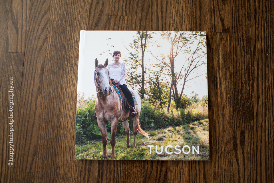
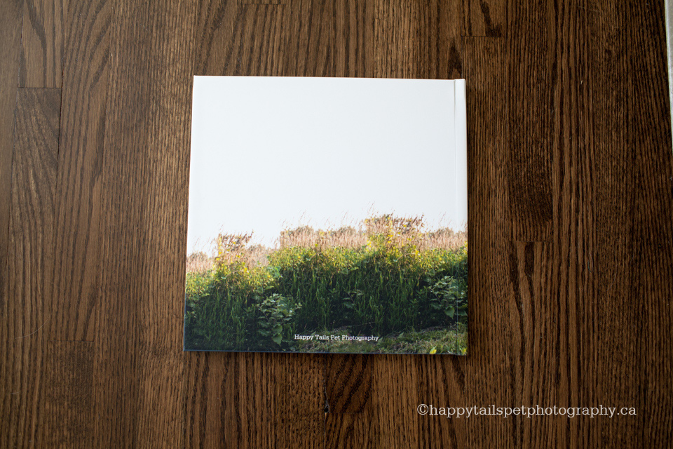
Tucson’s album is one of my favourites so far. I had originally picked a different image for the cover, but my client suggested this one instead and she was totally right — a perfect example of how the process can yield a great idea. It took some Photoshop work to get it stretched from front to back, but it was well worth the effort. I love how light and bright this book is.

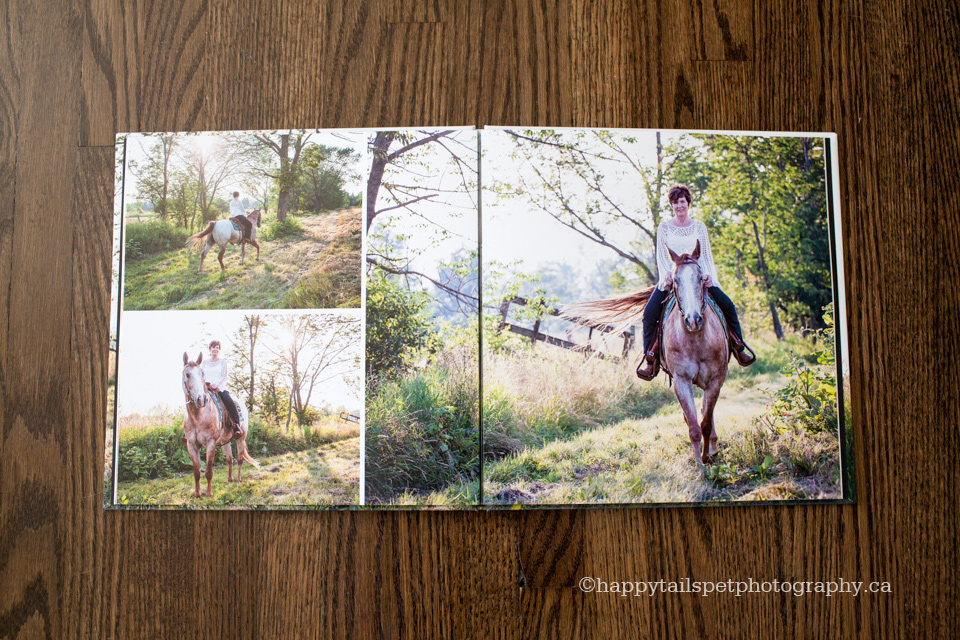
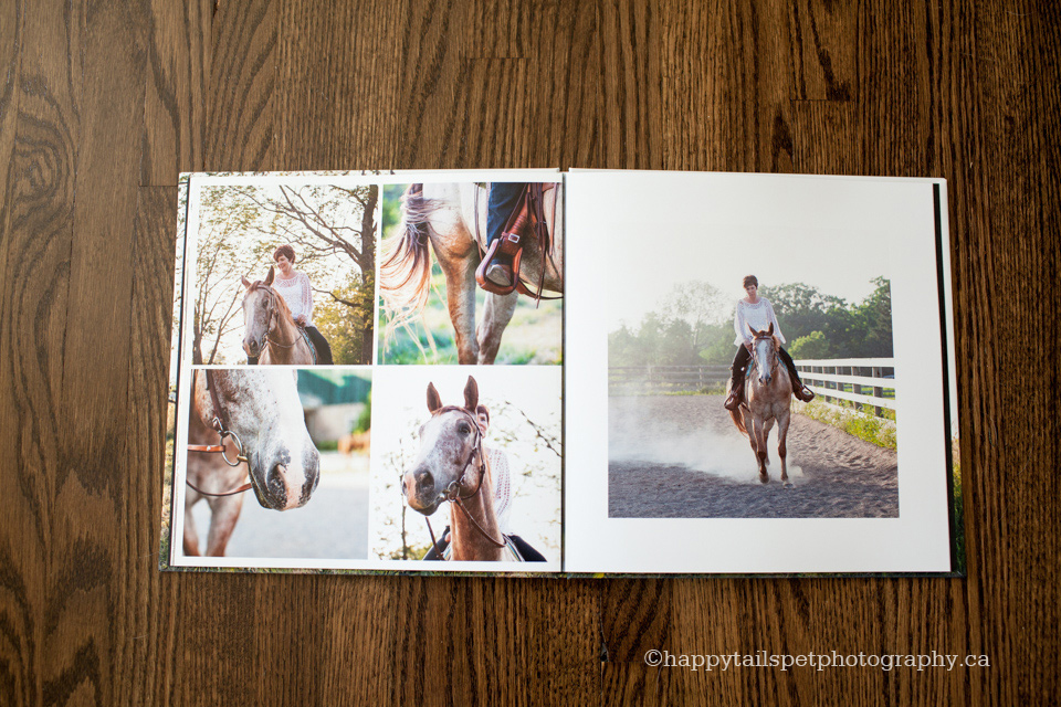
Kim also ordered a 30×45 canvas, prints and digital files — I’m so happy this great human-equine relationship will be remembered and cherished for many years to come!
Wags,
![]()
